Read Me
 Read Me
About the Author
I first encountered a Mac 128K at a friend’s Palo Alto home in 1984, but only started using them myself around 1987. The first Mac in my home was a SE FDHD, probably around late 1989.
During the 1990s I worked in a Macintosh-only computer store in downtown Berkeley, California — one of the few that is still around. I attended BMUG meetings and did various projects involving Macs on the nearby campus of the University of California.
WordPress Template
I was inspired by Stuart Brown‘s Retro MacOS Theme, and modified it for my use. Brown’s original design magnifies pixel elements 2x, for a post-modern take on the original look-and-feel. For this project, I wanted to see what the original artwork would look like on a 1:1 scale.
Fonts
A large part of capturing the look and feel of the Mac’s bitmapped interface is getting the typefaces right. With CSS3 and @font-face, we can come closer to simulating how Susan Kare’s fonts looked on screens in the mid 1980s.
Apple themselves have been shipping TrueType versions of these fonts since around 1990, when the StyleWriter was introduced along with System 7. However these versions have crucial differences. And Macintosh systems would have rarely used these TrueType outlines for display on screen at small sizes — the bitmapped versions would have been preferred if available. Thus the problem is to bring those hand-edited, bitmapped sizes into the modern era.
For this site, I’ve created versions of those fonts at fixed point sizes and encoded them in the modern TrueType format.
Another interesting project, along the lines of Apple’s 1990 conversion of some of its core fonts into TrueType, is Urban Renewal. This set of TrueType fonts re-imagines seven bitmapped fonts from the era of System 6 and earlier. Some of these were designed by Susan Kare, while others date back to the era of the Lisa.
Font Smoothing
Typefaces are important in and of themselves, but so is how the letters are displayed on screen. Thanks to the work of Bill Hill and others on sub-pixel rendering, or anti-aliasing, computers can now smooth fonts onscreen to make smaller point sizes more legible.
However this technique wasn’t available in the 1980s, and certainly not on the monochrome screen of the original Mac. I use two techniques which are both experimental parts of CSS3 to disable sub-pixel rendering on all type on this site.
 font-smooth: never; // for future browsers

-webkit-font-smoothing: none; // for Chrome & Safari
These seem to work reliably on recent versions of Safari and Chrome, but not in Firefox. They are responsible for the ‘blocky’ look of type on the site, which is a more accurate representation of how fonts looked on-screen in the 1980s.
Image Dithering
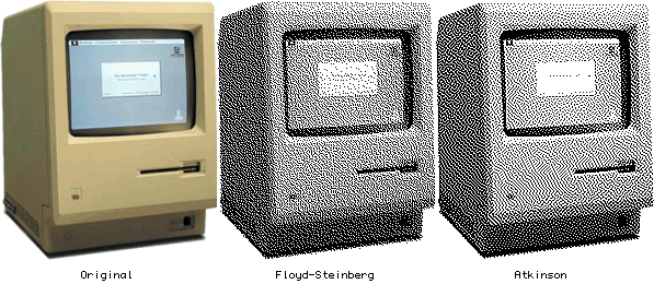
Before the advent of Color QuickDraw and the Mac II, early work with multi-bit images on Macintosh systems was constrained by the black-and-white screen. At the moment of image acquisition (from a scanner or video digitizer), and/or at the moment of display on the screen, the system had to make a decision about how to approximate tones and shades using only black and white pixels. This process is called dithering, and there are a number of slightly different approaches. Photoshop uses the Floyd-Steinberg algorithm for its “Diffusion Dither”, but Bill Atkinson’s work on early scanning devices resulted in a better approach one more characteristic of the images that were produced on monochrome Macs.
A free Mac program called HyperDither offers a direct port of these “Atkinson” dithering methods:

